Quantcast
Channel: Sandstorm's Blog (Home of ssUltimate Library)
Viewing all 160 articles
Browse latest View live

Sketches

$
0
0
Sorry, this is not about software developing.  I just wanted to create this entry here for my latest hobby which is pencil drawings.

When I was young (in elementary and highschool), I used to draw using a ballpen.  Then I stopped as my focus went elsewhere.  That was 29 years ago.

Last month, for whatever reason I decided to see if my hands are still there.  So I ordered a pastel color pencil in ebay and started making some sketches where immediately after completion, I posted it on my wall.  And while I deem my output as elementary, my friends say they love those.

Since I realize I don't have the patience required of a real artist as I want to draw and finish whatever I am working within just a few hours, I put aside my pastel (I realize that requires patience) and  I decided to work on pure pencils as making shadows there are easier.  While I do not have the proper grades (I lack 7b, 8b and 9b for darker ones), my friends also loved those as well so they started requesting I draw them.  And I did.

One time I decided to draw my departed brother.  Heck if I can take time to draw my friends, I will spend time to draw my loved ones too.  I have to draw him twice before I believe I got an acceptable output.  Today I decided to see how it will look like when in color.... so Photoshop color layering.  Below is the source pencil and photoshop output


Well I think I have done good here.


Tick/Untick Checkboxes on Grid with AllowCellSelection = .F. - Part II

$
0
0
Last time I have shown how to employ ticking/unticking of checkboxes on Grid with AllowCellSelection = .F. via utilizing MouseDown event of Grid.  So what makes this different than the first trick?  The first trick relies on Relative Column of Grid.  And this poses a problem when the columns are reordered via dragging into new position as Relative Column  will then change.

So it is not that foolproof and only will work when you don't rearrange the column orders.  This one though fixes that as this is no longer based on the relative column's position but will be basing on the ControlSource of that column.


Here is the sample code:

Local oForm
oForm=Newobject("Form1")
oForm.Show
Read Events
Return

Define Class Form1 As Form
      Height = 460
      Width = 400
      AutoCenter = .T.
      Caption = 'Ticking Checkbox on Grid with AllowSelection = .F. - PART II'
      ShowTips = .T.

      Add Object grid1 As Grid With ;
            GridLines = 0, ;
            Height = 380, ;
            Left = 10, ;
            Top = 70, ;
            Width = 390,;
            GridLines = 3,;
            DeleteMark = .F.,;
            ScrollBars = 2,;
            ColumnCount = 4,;
            AllowCellSelection = .F.


      Add Object label2 As Label With ;
            top = 10,;
            left = 15,;
            Height = 46,;
            caption = 'This is a simple trick on allowing the checkbox object to be ticked even though '+;
            "the grid's AllowCellSelection is set to .F.  The trick is on MouseDown",;
            WordWrap = .T.,;
            Width = 370,;
            Forecolor = RGB(255,0,0)

      Procedure Load
      Close Databases All
      Create Cursor junk (Products C(10), PickedUp L, Sold L, Returned L)
      Insert Into junk (Products) Values ('Apple')
      Insert Into junk (Products) Values ('Orange')
      Insert Into junk (Products) Values ('Mango')
      Insert Into junk (Products) Values ('Guava')
      Insert Into junk (Products) Values ('Banana')
      Go Top
      Endproc

      Procedure grid1.Init
      Local lnloop, lcColumn
      With This
            .RecordSourceType = 1
            .RecordSource = 'junk'
            .Column1.Header1.Caption = 'PRODUCTS'

            For lnloop = 2 To 4
               lcColumn = '.Column'+TRANSFORM(m.lnloop)
               WITH EVALUATE(m.lcColumn)
                        .AddObject("check1","checkbox")
                        .CurrentControl = "check1"
                        .Sparse = .F.
                        .check1.Caption = ''
                        .check1.Visible = .T.
                        .check1.BackStyle=0
                        .Alignment = 2
                        .Width = 93
                        .Header1.Caption = FIELD(m.lnloop)
                        .Header1.Alignment = 2
                  Endwith
            NEXT
      Endwith
      Endproc

      Procedure grid1.MouseDown
      Lparameters nButton, nShift, nXCoord, nYCoord

      Local lnWhere, lnRelRow, lnRelCol, loColumnsControl, lcSource, loColumn
      This.GridHitTest(m.nXCoord,m.nYCoord,@lnWhere,@lnRelRow,@lnRelCol)

      lcSource = ''
      For Each loColumn In This.Columns
            If loColumn.ColumnOrder = m.lnRelCol
                  lcSource = Upper(Getwordnum(loColumn.ControlSource,2,'.'))
            Endif
      Next
      Try
            Do Case
                  Case m.lcSource = "PICKEDUP"
                        Replace PickedUp With !PickedUp
                        WAIT WINDOW 'You toggled Pickedup Column'NOWAIT
                        This.Refresh
                  Case m.lcSource = "SOLD"
                        Replace Sold With !Sold
                        WAIT WINDOW 'You toggled Sold Column'NOWAIT
                        This.Refresh
                  Case m.lcSource = "RETURNED"
                        Replace Returned With !Returned
                        WAIT WINDOW 'You toggled Returned Column'NOWAIT
                        This.Refresh
            Endcase
      Catch
      Endtry
      Endproc

      Procedure Destroy
      Clear Events
      Endproc

ENDDEFINE


I have added a WAIT WINDOW here so you can visually see that it does change the proper underlying field.  Hope this comes useful to you!  Cheers!

HoverButton Class

$
0
0
Another button class for my need which may come handy to my subscribers as well.

So why make another one?  What is the main difference with this one vs say ButtonX?

On my BizCore ERP app, I use TreeView for my menu as I can easily control there what can be shown per user by hiding/removing nodes they should not be of concern.  See ERP app below:


However, for comparably smaller app like my Gift Voucher one, my GUI approach is different where I use background images plus images representing as button icons.  Why this design?  First, I want to give my users the capability to change wallpaper via a simple double-click.  That adds to user satisfaction because they won't be tied up with an appearance that they may not like as each user has his/her own taste.  Another is to make the app look bigger, LOL!  Here is that app showing different look impact by simply changing wallpapers.


And for that design, I need to have a button that will appear transparent and so this new control class.  ButtonX can be made transparent too via making nTheme parameter 0 (zero) and nLineSpecialEffect = 3.  However, when you do that, you won't see any hover effect (glowing blue) I did on MouseEnter here because that is tied up on the theme image which we ignored for transparency sake.   And so it is a bit harder to see where you are except on relying on the mouse pointer.


Unlike my other button classes, I made this one simpler via allowing the use of PEM instead of us typing This._setting(....) inside the class init.  So you can go to PEM and change its Picture, Caption, Enabled and ToolTipText.   Speaking of Enabled, when the class is toggled to disable, then these two (2) properties will have an effect on its appearance:

1.  _noHighlight (Default is .T.)  - When the class gets disabled, you won't see the hover effect of that glowing blue background.  Turn it to .F. to show that hover effect even if the class is disabled.


2.  _ShowLock (Default is .T.) - When the class gets disabled, a lock icon will appear on its top as additional visual guide.  If you don't want this, turn this property into .F.


Well that is it!  This is now part of ssUltimate.  Visit What's on ssUltimate Library for the list of classes inside ssUltimate.

RTF Keyword Highlighting

$
0
0
In 2009 I started playing with an RTF control and I created one organizer for my own need to store articles and any other useful info I can find in the web for later offline reading and reference.  I decided to do that because most of the time we don't have good internet here.

Well I was reworking the previous days on that old DevOrg app which consisted of a treeview and an RTF activeX controls as I decided to finally give it a filtering capability, insertion of image with rescaling and quality reduction, reworking the icon panel to look like a ribbon, etc.; and along the way, I thought of allowing it to highlight the words I typed to filter the threads and nodes of treeview.  So I can see outright where those are, like this:


The trick is to work behind the scene on its RTF codes. Here is the method I created for that:

*_HighLight Method

Lparameters cWord
LOCAL lcTable
lcTable = thisform._currenttable
SELECT(m.lcTable)
Try
   * Insert highlight color
   lcRTFSource = Strtran(rtftext,'}}','}}'+Chr(13)+'{\colortbl ;\red0\green255\blue0;}')
   * Add new highlightings.  Check proper, small, all caps
   lcRTFSource = Strtran(m.lcRTFSource,m.cWord,'\highlight1 '+m.cWord+'\highlight0 ')
   lcRTFSource = Strtran(m.lcRTFSource,Upper(m.cWord),'\highlight1 '+Upper(m.cWord)+'\highlight0 ')
   lcRTFSource = Strtran(m.lcRTFSource,Lower(m.cWord),'\highlight1 '+Lower(m.cWord)+'\highlight0 ')
   lcRTFSource = Strtran(m.lcRTFSource,Proper(m.cWord),'\highlight1 '+Proper(m.cWord)+'\highlight0 ')
   Thisform.corTF.olerTF.textRTF=m.lcRTFSource
Catch
   Thisform.corTF.olerTF.textRTF = rtftext
Endtry


If you notice, I have used three (3) possible cases, i.e., UPPER(), LOWER() and PROPER().  The problem is I can't force the RTF codes to any of these cases alone to ensure I can highlight everything as that will also affect the output.  So say I filter threads for entries with the word "javascript", then it can find and highlight words with javascript, JAVASCRIPT and Javascript.  But not JavaScript.

While I can instruct it with another function/method to look for any other transmutation of the word like JavaScript, JAvascript, jaVaScript, etc., I think that is an overkill for this simple need of mine.

So anyway, I am just showing here the trick on how to achieve that in case you use and RTF tool on your end and wanted to have the same on your end.  Cheers!

CtrlBox Class

$
0
0
This is another simple class that has been inside ssUltimate for quite a long time now.  But I designed this solely for the need of TitleBarX when I experimented on creating a control box that is purely made of shapes.  


However, recently I am changing my forms' appearances again and I now favor a form with no titlebar and border that is run maximized. And while users of my app know they can always press Esc key to exit any of my forms, I still want an additional way for them to close it via a mouse.

I have other classes for those need, i.e., CloseX, CloseX2 and CloseX2s (smaller version). But I suddenly thought last night it would be cooler to have a controlbox that has all that minimize, maximize/restore and close buttons. Only that though. I still do not want a titlebar as I use vfp's own _Screen and having its titlebar and another titlebar below it does not appeal to me.

So I tweaked this one last night. Now it can be dropped onto your form as well (if you intend to have a form that has no titlebar too) and it will adjust itself accordingly. Though I have to kill its form pinning feature which is available for use in TitleBarX.

Here is how it looks like on one of my forms:


CalendarX and DTPickerX Enhancements

$
0
0
I can safely claim that my calendar classes can compare with others when it comes to look and navigation speed being all the ingredients of a calendar are all staring the users in the eye (Months, Days and Year). And quite frankly, that is what IMHO makes it unique than others out in the market. And that is what makes my subscribers happy too.

Hotkey

Nevertheless, one of my new subscribers contacted me yesterday and inquired if it is possible to have hotkeys (shortcut keys) as well to navigate faster by keyboard for he is familiar with Quicken calendar which have those.  I said to myself, why not?  That is an improvement if I can think of a way to give those two classes that capability?  So I asked him to give me the hotkeys he is already familiar with.  Here is now the classes with the suggested hotkeys:


Why M for first day of month and moving backward one month later and H for the last day of month and moving one month forward later?  That is because it is easy to remember that M is the first letter of the word Month and H is the last letter, i.e., MontH.

Same as in YeaR.  That is quite ingenious by Quicken to have those hotkeys, if I may say so.  Very easy to remember.


This feature is now available for both CalendarX and DTPickerX classes.

Now, he is familiar with that and users of this library will all be, soon.  But what about other users? How would they remember such?  So I created a new property named _Expanded to allow the calendar portion of the class to be shown "initially" as Expanded (showing hotkeys) or not.  Default is .F.  Regardless of the initial appearance, interactively, users can Expand or Contract the class to show or hide the HotKey guides via clicking on the arrow keys or pressing those (right arrow key to expand, left arrow key to contract).  So they can refer to that guide until these hotkeys become imprinted on their minds then they can ignore seeing that hotkeys guide later.


Date Scoping

Added two (2) new properties named ValueMin and ValueMax.  Simply saying, this will restrict the class within those dates, if used.


Subscribers will be sent the update in a short while, but first I have to double check a new class I am working on called dtPeriod and ensure everything is okay.  For those who are becoming interested in subscribing to ssUltimate, click Contact Me above and shoot me an email.  Cheers!


DTPeriod Class

$
0
0
NOTE: I came to realize today that I have been skipping a subscriber on my updates because I forgot to add him on my list.  So if you are a subscriber and you have not been receiving any update for quite a while from me or you haven't received the update for this, kindly email me.  Also there are I think 1 or 2 emails of subscribers that no longer works.  Please contact me by mail so I can get the alternate email address.  You have to specify your old email address so I can verify.  Thank you!

=======

This is two dtPickerX class for our two dates need (from and to).  This is quite simple.  Drop this class on your form and choose its orientation, 1 for portrait (default) and 2 for landscape.

Why not logical?  Instead of 1 for portrait, why not use .T. and .F. for landscape?  Well I plan to create a 3rd look for this later when I got time.

This returns two (2) values, i.e., ValueFrom and ValueTo which are already self-explanatory.  Since dtPickerX now has that HotKey, then this one has that too.  It automatically switch values ensuring that ValueFrom will always have the lowest or equal value than ValueTo, removing your need to code those yourself.

On form, during developing, you will only see one (1) dtPicker.  But on runtime, it will be shown like any of these depending on your orientation.


And Oh, you can assign initial values on those too:

* DtPeriod Init
this.valuefrom = DATE(2013,2,12)

DODEFAULT()


Date Scoping

Min and Max Values.  Two properties I added just now are ValueMin and ValueMax.  Those are optional.  If you leave both empty, then there is no scope restriction.  If you set just the ValueMin to say DATE(2013,1,1), then the dtpickers can not go lower than that.  If you also set ValueMax to a date, then the calendars will be restricted with those scope.

As usual, I am open to suggestions and comments for the betterment of the library from existing subscribers or even from those who plan to subscribe but is wishing some features I have not created yet.

Cheers!

See what's on ssUltimate:

http://sandstorm36.blogspot.com/2015/12/whats-on-ssultimate-library.html


AnchorX

$
0
0

I decided to revisit my AnchorSizer class because basically I just dragged the old ssAnchorSizer from ssClasses then dropped it to my ssUltimate library, and simply renamed it (as well as GridSort and GridLock). My focus back then is on other new classes I was planning to make for ssUltimate and so I simply moved those ones there.

Today though, I decided to revisit my codes there... and I winced, LOL! And shuddered too, which is what we normally experience for the sheer horror of seeing our old codes after learning better ones. Anyway, I cannot simply remove that AnchorSizer anymore as others may be using those already plus while I do not like (now) the codes I used there and the way I manipulate resizing, those nevertheless work good on the resizing need.

So instead I created a new and better Sizer class for the insides of listbox, combobox and grid and named it simply as AnchorX. So what has been changed here?

1. Binding from anywhere on form. Unlike its ancestors ssAnchorSizer (for ssClasses) and AnchorSizer (for ssUltimate) which has a rule that the class should be on the same container as that of the object(s) that will be bound to it, this one can be bound to object(s) from anywhere within the form, no matter how deep it is.

2. Simplified codings. No more Macro Substitutions (Ewwww!). Shorter codes. Reduced number of class properties needed to bare essentials.

3. More precise calculations for resizing especially on grid. Whereas before, I have to force adjust the last column, this one does a real accurate resizing based on original column widths plus your grid setup (are DeleteMark, RecordMark and Scrollbar shown or not?).

4. Fixed problem on column naming on Grid. It won't care anymore on the names of columns plus its position/order.

5. No more extra call for its _Resize() method. The class now binds itself on form's resize.

6. Simplified calls straightly referencing the actual objects. This is only what we all need now:

* On combobox init:
Thisform.AnchorX1._cbo = this

* On grid init:
Thisform.AnchorX1._grd = this

* On listbox init:
Thisform.AnchorX1._lst = this


I urge my subscribers to replace AnchorSizer with AnchorX on their forms so I can totally remove that old class later from within the library. That of course will happen pending their later confirmation to me that I can then safely remove that...that AnchorSizer.


GrdSortLock

$
0
0
grdSortLock

Also a replacement for both GridSort and GridLock classes. This one combines both classes' capability into one. Like AnchorX, codes here are more simplified and straightforward.

What it can do?

Provide instant sorting capability on your cursor used as grid's recordsource. To use this class is as simple as dropping this class on form and declaring on target grid's INIT:

thisform.grdSortlock1._BindGrid(this)

By default, grid's column 1 will be sorted ASCENDING. Left-clicking on other column headers will make that column the sorted one as long as the underlying ControlSource for that column is not of Blog, General or Memo type.

Right-clicking a column header pops up options as shown below. So as the name says, it can sort and it can lock a column; or totally remove lock.


I urge my subsribers to likewise move into this later so I can also remove GridSort and GridLock (and again AnchorSizer) in the future from the library.

DropSwitch

$
0
0
February 13, 2017

Added MultiSelect capability.  It is controlled by two properties:

  • MultiSelect
    • .F. (Default), only a single switch can be selected each time from the dropdown list.  The caption of the selected switch will be reflected outright on the class
    • .T. or allow multiselect.  When this is set to .T., the caption will reflect the number of switches turned on (see image below)
  • mValues = are character values representing which switches are turned on.  On the image below, I set the initial mValues to 1,3,5.  mValues change on-the-ply, or when you turn on and off available switches.  Showing new Theme 17 I created just now too.


=====
February 9, 2017

Well, I've been meaning to do this for a long time but can't find much time to work on it.  But yesterday, I decided to finally do this.

What is DropSwitch?

It is a Control class with a commandbutton that has a dropdown form with several switches based on your desire.  You can think of the dropdown portion like an OptionGroup on a dropdown form, except that it does not use radiobuttons but my switches.


It is more like my OptionSwitchX class but this one hides the selection until you click the button.  So if you want to change the value, click on it, click anew on the popup selections (change will reflect on-the-ply), and click outside.


Some more differences with OptionSwitchX:


1.  In OptionSwitchX, I manually created 12 switches as max. Anyway, for more than that need, I counter they can use a grid, listbox or combobox for the needed selections. 12 switches, IMHO, is already enough.

DropSwitch does not have that limitation though as switches are created on-the-ply by the class based on your Caption, e.g., Credit,Cash,Cheque,Cover,Special,Internal.  So it will create 100 switches if you put 100 words separated by comma on Caption property.

2. OptionSwitchX utilizes the _Settings() method.  DropSwitch is via PEM

3.  OptionSwitchX is a container class.  I made OptionSwitchX as container because I need to be able to reach inside it during design time to re-position the switches to where I want those to be.  Just like if I want those to be shown in landscape format.

DropSwitch, as mentioned, is a Control class.  It takes care of the arrangement of the switches as controlled by Columns property.  So if you want to make a single columned switches based on the caption above, you can say put 5 on Columns property.  Then the class will position all switches that it will create on column 5 of the popup form (as shown above).

If you put on Column a value of 5,85 then the class will adjust itself to fit the switches to the desired columns


If you put on Column a value of 5,85,165 then again it will adjust itself.


4.  OptionSwitchX eats more form space in comparison with this one as what will be used by this one is just a space for a single commandbutton.


You can use all the 20 themes of SwitchX class here.  Here are some of my faves:


It returns two values:

.Value = the numeric value representing your selection, similar to an optiongroup
.ValCaption = is the Caption of the current seletion as reflected on the commandbutton it uses

You can set which of the switches based on the Caption property will be the starting value via Value property.  So in the above images, starting Value is 2.

Properties:


  • FontName and FontSize = adjusts the caption, height and width of the commandbutton (won't affect the popup selections)
  • Value and ValCaption (as Explained above)
  • Columns (as explained above), allows you to control the column positions of the switches plus allows the class to calculate the number of rows it will use for the popup class
  • Interval = is the spaces (row wise) between each switches.  By default, it is 20.  But you may want to increase or decrease the row gaps between each switches to your liking so this is the property for that
  • _PopWidth = controls the width of the popup selections.
  • _nTheme = is the theme for the switches
  • Caption = is the Captions of the switches on popup form
  • SpecialEffect = how the button will look like


Right now, you can use its Click event to perform say a method when you change its value


This is a young class so I may add more features in the future.  Also I may add another version of this or just simply morph this to allow Multi-Selection of switches.  Cheers!

P.S.  This is part ofssUltimate Library.

EditX 2017.02.20 Version

$
0
0
Okay. So for new readers, what is this EditX again? 

EditX is a dropdown editbox control class to save space on forms and grid. This is especially designed to show and handle contents of memo fields. 

Another new subscriber seems to be very much interested in this especially on grid usage so after a long time, I dug this one out again. And decided to do a major overhaul to satisfy them, and of course to make it better further. 

So What is New? 

  • More responsive. Unlike on the previous versions where when inside a grid cell, you need to click twice, first on that cell to activate it then next on the arrow to fire the dropdown section, with this one you can click on the arrow straight from anywhere and it will fire outright
  • Added ReadOnly. This allows us to use this on Grid to show memo notes and to either limit it to viewing purposes only or to allow direct editing of underlying ControlSource's value
  • Cosmetic adjustments. Adjusted objects positions and sizes depending if it is on form or inside a grid. Changed down arrow to a better one.
  • Finally, cleaned up old codes and other objects and replaced those with better and leaner ones. 

Advantages of EditX vs native EditBox? 


  • On Form 
    • EditX on form eats less space than an editbox because in form, it looks like just a plain combobox with a value and a dropdown button. 

  • On Grid 
    • EditX, since it looks like a plain combobox eats less space too. But this can show the users the complete contents of a memo field. 
    • Alternative to EditX on Grid are: 
      • Using the default textboxobject. On a cell, this cannot show the content of a Memo field. To counter that, we use CAST() to convert the memo field into a character one. But then you have to force your users to be satisfied with these limitations: 
        • It will show CRLF as square boxes. This can be cleaned up further via STRTRAN() but will remove paragraphs. 
        • Still partial display on long values of memo field 
        • Wider Column needed (yet still partial display) 
      • Using EditBox instead of default textbox. This will allow the content of that memo field to be shown. When this alternative approach is used, most probably the developer increases grid's RowHeight to allow the editbox to show several rows. While this gives a better way to show the contents of the memo field, it affects other objects though because you can't dynamically change RowHeight based on the content of the editbox. So the rest of the other cells are forced to have the same height and it is not that good too, visually speaking. Plus this action results to lesser rows to display on Grid. 
With EditX, you don't have to worry about those. See for yourself (click on image to see those on actual size)!


Check ssUltimate and Subcribe!!!

TitleBarX Color Cycling Trick

$
0
0
What is TitleBarX again?

It is a class to replace the form's titlebar.  It has these features:

1.  Two captions
2.  Ability to change on-the-ply its color and the objects on a form, and retain those via a popup colorwheel

To take a thorough glimpse on what this class is, click here

A subscriber emailed me just now and asked if we can change its default behavior of picking up the last color scheme.  What he wanted instead is to dictate to the class the color cycling which is based on the day of the week.  So for Monday, a color, Tuesday another color and so on...

Well, the trick is simple enough so I will show it here in case some of those who use it wants to do the same.  The trick is to put something like this on its Init Event:

* TitlebarX Init
DODEFAULT()
Do Case
      Case Dow(Date()) = 1
            This.BackColor = Rgb(0,128,128)
      Case Dow(Date()) = 2
            This.BackColor = Rgb(128,255,0)
      Otherwise
            This.BackColor = Rgb(138,176,66)
Endcase
This._swapcolor()

And that is it!  Cheers!


xBox on MySQL Backend

$
0
0
One of my subscribers is using MySQL as his backend so I requested him to provide a tutorial, as I do not use that backend myself, on how to use xBox on that one.  This guide can be useful to others too who has a different backend aside from that of VFP.  So here it is, it is quite simple actually:

Author:  Glenn Palic
Date: April 1, 2017

How to use xBox on MySQL Backend

1.  Make a connection with your mysql backend using ODBC in load event of your form

Example:

Public pnConnectionHandle,oConn

oConn= "Driver={MySQL ODBC 5.1 Driver};Server=localhost;Database=Yourdb;Port=3306;uid=username;pwd=password;Option=3;"

SQLSetprop(0,"DispLogin",3)
pnConnectionHandle = Sqlstringconnect(oConn)
If pnConnectionHandle > 0
      *   successs
Else
      Messagebox("Can't connect to the Server please inform network administrator.",0+32,"Error")
      Quit

Endif

2.  As xBox uses InteractiveChange event, then do it like this now:

Local lcSQL, lcName
lcName =[%]+Alltrim(This.Value)+[%]
TEXT TO lcSQL NOSHOW
  Select LastName, FirstName, CustomerID From customer WHERE LastName like ?lcName
ENDTEXT
SQLExec(pnconnectionhandle,m.lcstr,"junk")
If !Eof()
      TEXT TO lcSQL NOSHOW  
            Select * From junk ORDER By 1 into Cursor junkemp NOFILTER
      ENDTEXT
      This._searchgrid(m.lcSQL,'junkemp.LastName','junkemp.CustomerID')
Endif

And that is it!

The only difference between using VFP table is it does not need that first transfer to junk above.  The second transfer to junkemp is necessary for the _SearchGrid method to kick in.  I guess there won't be too much difference too on another backend such as MSSQL.  Cheers!


MariaDB - Speeding Up Records Migration

$
0
0

I started testing MariaDB as my new backend and while it is simple enough to do the switch onto that, there are some things that I need to adjust on my VFP codes.  Some of those are the field types, for logical fields I have to use TINYINT (for MySQL ODBC 5.1 or later) or BIT (for MySQL ODBC 3.51), for dates it does not accept {} for an empty date, etc.

However, this post is not about that. It is more on the speed of migration approach.  Bear in mind I am new with this, only less than a week but I think regardless of it, this can help some who might be using MariaDB or MySQL as backends.

One way to connect from VFP to MariaDB is via SPT (SQL Pass-Through). With a code like this:

If SQLExec(gomyapp.DbBaseConn,'INSERT INTO MyTable (MyField) VALUES (?m.lcMyValue)') <= 0
      Aerror(laError)
      Messagebox(laError[2])
Endif


So that will create a new record from VFP to MariaDB table.

But as you can see it is done on a per record basis.  And testing migrating one of my smaller tables in VFP to MariaDB containing only 589 records using SCAN...ENDSCAN approach took me .5333 seconds.  It means that transfer speed on my end per record is at .000905 of a second. Take note that speed is affected as well by number of fields to transfer.

Since I have to migrate as well another table which contains 1,237,000 records and has more fields than my first per-record SPT above, we can safely presume basing on that .000905 of a second transfer rate per record that it will take me an estimated 18 minutes and 67 seconds to completely migrate this bigger table.  And damn, that is a very long time to wait.

So I sought another way and found out about LOOP Statement of MariaDB.  But we are in VFP so I would prefer to have something that we are already familiar with.  Still using SCAN...ENSCAN, I decided to create a batch of records with the help of TEXT...ENDTEXT and I was satisfied with the result.  However, there is one caveat, i.e., CONCATENATION.  A variable can only hold so much characters that eventually it will fail. I tested transferring 80,0000 records in one go and it was comparably faster.  But then per my test (and per number of characters on the text SQL INSERT INTO resultant), when I tried 100K of records, it failed due to concatenation.

Solution, do it by batch.  Here now is my preferred approach to transfer huge records. I decided to do a batch transfer of 5,000 records per SPT. Over-all result is from that calculated 18.67 minutes, it was slashed down to just 6.0167 minutes.  Here is the migration codes I used:

Local lcSetDate, lcBatch, lcValues, lcSQL, lcTop, ldStart, lnRecords
Close Databases All
Use vouchers Shared
lnRecords = Reccount()
ldStart = Datetime()
lcSetDate = Set("Date")
Set Date To YMD
lcTop = 'Insert Into vouchers (serialno, dsent,usersentfk,customerfk,userusedfk,storeredeemfk,'+;
      'dused,dtransfer, denomfk, storagelocfk,minvfk, mtfk, qrcode) VALUES '
lcBatch = ''
lcSQL = ''
Scan
      TEXT TO lcValues NOSHOW TEXTMERGE PRETEXT 12
('<<serialno>>', '<<IIF(dsent={},[0000-00-00],dsent)>>',<<sentfk>>,<<storefk>>,<<redeemfk>>,<<storeredfk>>,
'<<IIF(dused={},[0000-00-00],dused)>>','<<IIF(transfer={},[0000-00-00],transfer)>>',
 <<denomfk>>, <<storagefk>>,<<minvfk>>, <<mtfk>>, '<<barcode>>'),
      ENDTEXT
      lcBatch = m.lcBatch + m.lcValues
      If Mod(Recno(),5000)= 0 Or Recno() >= m.lnRecords
            lcSQL = lcTop + m.lcBatch
            lcSQL = Left(m.lcSQL,Len(m.lcSQL)-1)+';'
            If SQLExec(gomyapp.DbBaseConn,m.lcSQL) > 0
                  Wait Window 'Writing up to '+Transform(Recno()) Nowait
            Else
                  Aerror(laError)
                  Messagebox(laError[2])
            Endif
            lcSQL = ''
            lcBatch = ''
      Endif
Endscan

Set Date &lcSetDate
Close Databases All
Messagebox('Started: '+Ttoc(m.ldStart,2)+Chr(13)+'Ended: '+;
      TTOC(Datetime(),2)+Chr(13)+'Elapsed: '+Transform((Datetime()-    m.ldStart)/60))

Well then, you can expect some more tricks here in the future on VFP to MariaDB.

Hide/Unhide Grid Columns

$
0
0
This is actually per request of my very first subscriber MK Sharma.  So he was looking for a tool to hide/unhide grid columns on-the-ply that he asked me if this can be incorporated on the ssUltimate library.   I said okay I will look into it but I was busy with simultaneous projects these days that I kept shoving it at the back of my mind.

Finally I became a bit free of my workload and so I decided to work on this one today.  I did not realize adding this feature will not require a lot of my time that I kept unnecessarily putting this request on hold thinking I will do it later when I am free, which happens today; as it is hard to concentrate on extra things when you are already working on 3 projects simultaneously.

Anyway, that feature now is part of GridSortLock class.  So this means said class can now Sort, Lock and Hide/Unhide columns of the grid.  Here are some images of it:


If you notice, the Hide option becomes disabled the moment the class detects that there is only one remaining visible column in the grid.  That is by design as the class fires at a header click/right-click so I need to retain one for the popup selection to be shown.

Moreover, I changed the sort icon to a simpler one again.  In the end, I find the current sort order harder to distinguish in the previous icon I used so that blue one now.

One more reason to subscribe to ssUltimate library, don't you think?  


grdSortLock - Some More...

$
0
0
After adding the capability to hide and unhide column(s) yesterday, I decided to add some more features for this.  I can edit yesterday's post but then those who read it already may not be aware of the additional changes I made after that as they may no longer revisit that other post  so this new post.  Here are what is new (again) on this class:

1.  Cleaner arrow icons representing sort order.  Also I realized some plain users may get confused with the terms Sort Ascending or Sort Descending  so those are replaced with simple terms which are Order Up and Order Down


2.  Added now the locked icons if  a column is locked as additional visual guide.  So here is how it will look like now with locks implemented


3.  Added other more visual Toggling for RecordMark, Theme, GridLines, ScrollBars and Views. It means your users now can change those on-the-ply based on their taste


As for Views, this allows you to change something like this

Into this:

But while those other toggling are cool to give users a chance to change the looks of the grid based on their taste, those are half-baked so to speak being those are not retained by the class right now.  So when I have another more extra time, I will give this class that capability to remember a grid's last settings, per machine, so a user can personalize their grids and keep those preferences.

Well that is all for now! Cheers!


DTPickerX Revisited

$
0
0
Talking to one subscribers via FB Messenger last night made me aware that he is not aware of all of its feature so I decided to create this now to itemize its important features.

Return Values

Others may not be aware but it does not simply return a date or datetime value.  It returns a lot of other values as follows:

  • Value = depending on nLevel property, it can either return a date value or a datetime value
  • nYear = returns the numeric year of the selected date
  • nMonth = returns the numeric month of the selected date
  • nDay = returns the numeric day of the selected date
  • _BOM = always returns the beginning of month of the selected date
  • _EOM = always returns the end of month of the selected date
  • _DateTime = regardless of nLevel, always returns the datetine value of the selected date
  • SQLValue (new) = always return the date on YMD string format.  Useful for other backends such as MSSQL, MySQL, MariaDB or any other backend that requires the same format

Language Localization

Todate, dtPickerX supports seven (7) languages per request of subscribers as follows:

0=Indonesian, 1=English, 2=Italian, 3=Spanish, 4=Turkish, 5=Romanian, 6=German


nLevel property 

This allows the class to morph based on your need as follows:

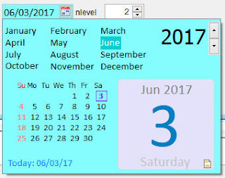
1 = month year picker only.  Notice that it shows also only the month and the year on the class itself.  This is useful such as in reporting where you want to go quick to a specific month and year (regardless of the day).  Then you can use _BOM and _EOM to get two dates for the whole month.


 2 = with calendar.  Well this is the standard need of a datepicker.  What makes this class unique among other date pickers is faster navigation as months are already shown above.


3 = full with time.  Take a look at the class as it again adjusts its appearance to include the time portion.  Also below the year spinner, two new spinner appears, i.e, hour and minutes.


Any changes done to any objects on the popup form is reflected outright on the class itself.  Also disregarding the nLevel property of the class, you can always get all the return values as mentioned above.

HotKeys for Faster Navigation.  Some users may still not be aware of this but hotkeys has long been implemented as well on the class per request of one subscriber.  The guides can be seen by hovering your mouse pointer into that innocent icon below the calendar face.  I was trying to capture it but since it s based on ToolTip, then it is hard to do that.


Currently, HotKeys guide supports 3 languages (German, Spanish and English) pending requests from other subscribers and submission of the corresponding localized words as well for those.  This is tied up with Language property

HotKeys in English are:

+,=,Up Arrow = Next day
-,Down Arrow = Previous day
T,t = Today
M,m = First day of month, then back 1 month
H,h = Last day of month, then to end of next month
Y,y = First day of year, then back one year
R/r = Last day of year, then to end of next year
Spacebar = Pops dropdown calendar

To easily remember these hotkeys especially on the month and year navigation, we used the first and last letters of the world MontH as well as YeaR to move backwards and onwards.  These hotkeys work even if the dropdown portion is not shown.

ControlSource

As with other native objects, you can also bind this class to a field via its ControlSource property

Visual Appearance

You can now also change FontName, FontSize, ReadOnly and BackColor of the class


DTPickerX on Grid

Now, for this one to work properly on your end, you have to ensure that you have SP2 or above for VFP as there are needed adjustments and bug fixes there especially on Control Classes.  You can get it here  http://msdn.microsoft.com/VFOXPRO.


IdleTime

I added this as well so you guys can control the time before the popup calendar automatically hides itself when it gets idle.

Well there you have it.  Maybe there are some more, I will add later if I recall.  Cheers!

Breaking down Grid's Column object

$
0
0
A foxite member has sought assistance on how to make an active cell of a specific column change color, as additional visual highlight, upon receiving focus.  Of course it means AllowCellSelection is .T. to allow that specific cell focus.  So I showed him how via a sample code whereby I manipulated both GotFocus() and LostFocus() of the text object for that column to change the backcolor when it receives focus and to return it back to white on LostFocus.

I am using my smartphone's touchscreen to create this post so I will give example codes on Tuesday when I go back to the office and can use my laptop to post the codes here.  In the meantime, I will just explain in words these new findings.

I said new findings because a fellow respected member of Foxite, Tony Vignone, has mentioned on a comment under mine  that lostfocus is not needed on my sample codes as it achieves that switching of backcolor even without it (lostfocus codes I have shown) though he is not clear as to the whys.  So he asked me if I have an idea as to the whys.

And yes, having manipulated objects of VFP myself to create a single new object in form (control classes like xBox, PopCalc, DTPickerX, EditX, etc.) for my ssUltimate library, I do immediately got a "new perspective" of how a grid's column is composed of.  And this is what I am sharing here now.  How really is a column of a grid composed of?

Column's Composition.

Originally I think of a column consisting of 3 objects.  A container, a header and a textbox (by default). His comments helped lift up the fog in my eyes which resulted to this new perspective of a grid's column's composition now.

Here is how I think now how a column is composed of:

1.  Container also known as the column
2.  Commandbutton (for header)
3.  Textbox (to show the values on top, what is merely shown on allowcellselection = .f.).  We will term this as upper textbox.
4.  Another texbox that works as the activecell when allowcellselection is .t., we will term this as lower textbox.

What is new above?  That upper textbox has never occured to me and most probably to most of you as VFP do not show it on PEM.  But that is not surprising as VFP's grid and other objects such as pageframes, listbox, combobox, etc.; are nothing but just manipulated combined objects; just like a control class.

So like I said, a column actually consists of that extra upper textbox hidden in PEM.  We will put this to a test in a short while here.

Having said that about the upper textbox, then all we need to achieve changing backcolor of an active cell of a grid is to simply "change the backcolor of what is seen as text1 of a column", either by PEM or by code in its init event.  Try it.

Going back to Tony's question of how the grid was able to restore back the cell to default white when it looses focus without any codes on its lostfocus event, that is because that text1 or what we termed above as lower textbox is the one used by grid (talking about default objects of a column) for its active cell.  While on the rest of inactive cells, grid is switching to that upper textbox hidden in PEM.

To prove this theory further is simple.  All you need to do is set Sparse propery of that column to .F. and presto, you will see that the whole column will now turn to that lower textbox' backcolor.  Because what Sparse = .F. does is it simply turns the upper textbox veil as invisible.

Again, activecell uses lower textbox, inactive cells uses upper textbox object hidden in PEM.


NavigatorX class

$
0
0
Updates June 21, 2017

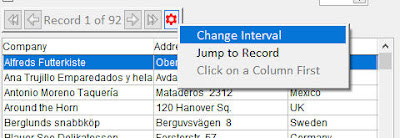
Added Options button (red gear on the image below)

Default value is shown.  You can turn it off via setting NoOption property to .T. and this button will be hidden.  Useful in some cases where we want to restrict users to specific things only.  This Option button (right now) gives users on-the-ply capabilities to do any of these:

  • Change Interval - by default, the interval of skipping a record is one (1).  It can be set on the PEM, Others tab into greater number but then you will be stuck up on that fixed interval.  So I decided to give users the capability to change skipping of number of records at their whim, and so this.
  • Jump To Record - is requested by a subscriber after I updated them yesterday.  This allows you to specify the record number to jump stright into that.
  • Set Filter (available only when bound to Grid) - allows you to filter grid records on-the-ply. 
  • Remove Filter (available only when bound to Grid) - as the name implies, remove the filter that you set above.
After posting this, I continued on testing the class and I made further changes to the Filtering Capability as follows:

It now forces you to click on a target column first before it allows filtering. If you haven't, it will give you the message 'Click on a Column First' which cannot be selected too.


That is because it has to know on which column of the grid it should perform the filtering.  After clicking on a header, then that is the time it will show the filtering capability and mentioning as well the target field like this:


In the above image, I clicked on the header of column for Company.  Please note that when it says Set Filter to Company, that company there is the underlying field used by that column and not the column header's caption.  That allows the users to realize too where they are performing the filter.

However, I remember that not in all cases, a filtering feature is good because there might be cases where there is already a filtering implemented in a grid and if we use this class filtering capability, then it can overwrite the filter condition which you guys set by codes.  And so for cases like that, I added the NoFilter property.  Set this to .T.  and it will not show that filtering capability anymore.


Miscellaneous Effects

Miscellaneous effects for GUI can be done via playing with these properties:

1.  BackColor, BackStyle, SpecialEffect, BorderColor, and BorderWidth.

2. Hover Effect.  Cousin Glen suggested an idea to show the border of the class on Mouse Enter.  I like it so I added it here as well.  To make the effect look better (at least to my taste), I changed SpecialEffect to zero as default.  So now when you move your mouse on top of the class, it is suddenly raised and when you move away from it, it goes back flat and borderless.

Some more ideas may come to me in the future about this class or some may be suggested by others.  We will see.
====


NavigatorX is a new control class that handles record navigation like going to top, previous record, next record, and going to last record or bottom.  I was browsing for some things on the web when I saw again a Paginator (Page 4 of 24) and I said to myself, well this looks cool to be added to ssUltimate Library?  But since we are not dealing with pages inside VFP as we have grid, then it is best known to us as a navigator.

Right now, I gave it these properties:

1. Interval (default is 1).  Tells the class how many records it will attempt to skip

2. NoIndicator (default is .F.).  Sometimes if you decide to use this class on a non-sequential record, then it looks ugly to see the record indicator jumping from record to record.  Such as filtered results in a grid or a sorted one.  In which case I deem it best not to show this indicator and so you can set this property to .T. for that need and the class will adjust position and hide that label indicator

3. As for that Record Indicator, you  can control its appearance by using any of these 3 properties, i.e., FontName, FontSize and FontTop.

4. Appearance of buttons and borders are affected by SpecialEffect (default 2 or hot tracking/hover effect)

Aside from its default actions where those are intended to, you can also add your other commands in its Click event.  Just ensure that you will issue DODEFAULT() first prior to your other codes like this:

DODEFAULT()

* Do other things

For the appearance, you can further change Backstyle, Borderstyle, Bordercolor, etc.

If you bind this to a grid, clicking on grid will also update the navigator's Record Indicator bound to it

How to use this?

1.  Drag and drop onto your form
2.  On Form Init event (I prefer this event to ensure everything is already instantiated such as the needed recordsource), bind it to the controls you want refreshed.  Said controls should be bound via ControlSource or RecordSource where a simple Refresh is need to show the changes made.

This.NavigatorX1._Bind(this.grid1,'myRecordSource')


And that is it!  This is now officially part of ssUltimate Library.

DropTime Class

$
0
0
Over the years, I tried to find ways to speed up and provide a unique time picker for my users and subscribers.  And I ended up working on different classes for this need:

DropClock - is a time picker based on combobox.  It has Interval property (default is 1) that allows faster picking of the hour and minute portion.   If interval is say set to 5, then the values shown will be with interval of 5, i.e., 5,10,15,20.... But it still is not fast enough because user still has to scroll down on the combobox especially if Interval is on default 1.


Then I created ScrollTime class which is like on Android.  It works with mouse scroll where you position your mouse pointer above the hour and scroll up and down.  The same on minute.  But it still is not fast enough too, plus it eats space on form.


Finally I created TimerX which is what I used in dtPickerX class for its time needs.  This is based on spinners so user can either type or spin the values.  But then it still is not fast enough.

I need something that will really make my users and subscribers' lives easier.

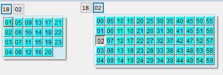
Finally I thought of a new idea this morning and I started working on it.  And behold my latest class, DropTime class.


And using this is damn very fast.  Where the user will simply do this:  click, click, click, click.  Just like when you are reading it.  Of course, nothing will beat a textbox with picture "99:99" as all we need to do is type 4 numbers there.  But who wants a plain textbox for time these days?

Anyway, finally I am very satisfied with this that I also replaced TimerX in dtPicker with this one.


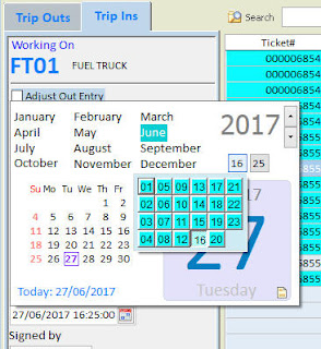
I am sure you will say, why not put the dropdown time going to the right as it looks better?  Until I find why clicking outside the border of its parent form causes it to close the dropdown portion of dtPickerX, it will remain that way.

Additional Properties for the dropdown section only

Themes = Default value is .F..  Turning this to .T. will remove the sunken effect of selection and will replace the appearance with a 3D effect

Alignment = 1 is Left (Default) and 2 is Right (Default on dtPickerX)

BackColor and ForeColor = well, colors

This will be part of the next update  to my subscribers (including the enhancements on NavigatorX).  Cheers!


Viewing all 160 articles
Browse latest View live